Moving Toward the Story 2

This is a continuation of the first blog on this subject “Moving Toward the Story”.

It’s time to reevaluate what’s happening here, this is done by asking questions.

What do I like so far;

  • The subtle play of red showing through the grey
  • The big interesting shapes in the truck

What I don’t like so far;

  • The area of her face and hat in shadow are looking too harsh now
  • Still not sure about the blue behind her head
  • Areas still need more developing, but which areas?

O.K., so those were design related things, now…..how about the story? I want the young woman to have some mystery about her. What is her situation, who is she? I want to keep her upper face in total shadow so that you can add her expression. Since there won’t be information in the upper part of her face I need to explain who she is by other things; such as her stance, her clothing, even the texture of her hair.

To set the scene to fit my narrative, the truck needs to be older and in the country. At this point I’m really liking the black and grey against the background so am not going to add the subtle colors that were intended at the beginning. This is where “listening to the painting” is so important, sometimes we can steam roll right over something that is better than we originally planned.

Finished painting, Pure Americana

When color is no longer a concern, value does the heavy lifting. Just because I have all the values to work with between black and white, doesn’t mean I should use them all, in fact I want to use as few as possible. Adding more detail to a painting is really a matter of breaking the big shapes into littler ones with more values. The more an image gets broken down the weaker it becomes. The big interesting shapes become what I call “mushy”.

I also want to orchestrate the values, not following the reference image exactly, but using it only for the information I want.

Where do I want the most emphasis? In the girls face and outstretched arm, so that will be the only area that goes to total black.

What role does the truck play? Supporting cast. Really hold back on the values here. How few can I use to explain just enough, three.

And that blue passage behind her head that I wasn’t sure of at the beginning….I really like it now, adds to the Americana feel, in fact the title of the painting is “Pure Americana”.

Continued on Moving Toward the Story 3

Moving Toward the Story

My most recent painting is a perfect example of how the story I want to tell drives the entire process from sketch to finish.

It began with the photo of the girl, who was actually standing against a stuccoed wall, outside in a friend’s backyard. I began projecting who this girl could be, with her hand touching the brim of her hat. This scene could have gone in hundreds of directions, but I took it into a direction that means something to me. Ideas began to form:

  • Outside in the sun
  • In a open field
  • In a nostalgic scene
  • Searching for something in the distance

How do I convert these things into the visual language of paint?

  • Take her out of the original background, put her in a new one
  • Get the feeling of blazing sun and nostalgia by painting most of the scene like a faded photograph with the edges a warm burnout
  • Add an old rusted car to reinforce the time period and add to the story of “what is she looking for?”

Remember this is the initial frame work to get me going, during the process I will be open to things that may need to change. Design is always my first concern, the subject second, so I’m willing to “let go of” some things in the subject that may have seemed important when I started.

Image 1

After I had put on a warm wash and let it dry I went in starting at the most important area, the face and hand. I feel the start sets the stage for the whole painting, and I wasn’t liking this. This is what I call a “false start”.
What’s wrong? I wanted the painting to be made up of very muted colors, but at this point with all the very intense background wash showing I could not judge anything subtle. That background was just screaming too loud!

So what are my options? The mistake I made here was trying to do something complex too early in the painting. The solution is to move into the simplest from of subtle color, which is black plus white for various shades of grey. At a more advanced stage I may go back and overpaint with subtle colors, or not, I’m leaving the possibilities open.

Image 2

Image 2 above; I’ve worked the same areas with the black plus grey mixtures and I’m liking it. Notice how her face is the same black value as her hat, this is part of simplifying, letting somethings go. I may separate these at a later stage but right now I’m looking for simple design and harmony.

to be continued on the next blog post “Moving Toward the Story 2”

Developing the Idea

I’ve been asked how I develop the idea for a painting. Here is the process I went through in a recent one.

Finding a subject that resonates with me in my reference photos is the first stage, photo #1. I liked the gesture of her stance and the way the light is falling on the right side. I will replace the background barn and the foreground gravel, I want to tell a different story about her.

Photo #1

Than fleshing it out, how can I made this scene more of what I want to say? The photo on the left below, shows a cropped section of grass from a painting I did several years ago, (you never know when those old paintings will come in handy), which seemed a good environment for her. I’ll be omitting the barn and mountains in the back, just wanted the grass texture. Also it seemed a tractor would add to the story I want to tell, ( decided to use a red one instead of the yellow and red).

Putting them all together, it’s beginning to work. Notice how I cropped the figure in closer. A close cropping makes for bigger, bolder shapes, as well as focusing on what I feel are the most important parts.

For the first stage of this painting I decided to put a wash on the painting surface. Why? The glow of a colored wash on a white canvas can only be accomplished at the beginning. I’d like this glow to show through in small areas as the top more opaque layers of paint build up. I chose to use an orange tone under the green field area to add warmth, because green can sometimes be problematic as a raw cold color. In the area on the girl, I washed on a warm green because in real life the green in that field would be reflecting all over her. Also it creates a harmony within the painting. See the video below-

Diane, applying the initial warm wash on the canvas surface.

To be continued in part 2. . . . . . .

Evolution of a Painting

Drifting

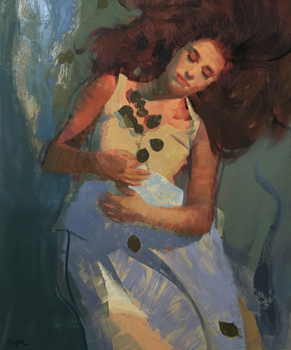
Have you ever “finished” a painting, than weeks later , saw that you missed the original idea? That’s what happened with Drifting, the painting below.


I was really excited about this image, my thoughts exploded in all directions.

  • I liked the vantage point from above, wanted a – floating, drifting, sleeping feeling.
  • I liked the intense warmth, wanted to manipulate this from warm at the top to cool at the bottom.
  • Wanted her to exist in two worlds, one of reality and one of graphic design.

Any one of these would have been interesting, but all of them at once was too much. There were parts of the painting that I really liked; her face, hair, warm light, the composition. However I got lost along the way, the relaxed flowing atmosphere I had originally pictured was not there. So how did I go about bringing it back?

First deciding what needed to change.

This is a breakdown of the areas that needed the most changes.

  • #1, shows where the color transition from warm to cool needs to be fixed. Because of the way cool colors recede, she almost looks like she is bent forward at the waist. The change is too stark, some cool would be good in the lower half, but this is too much.
  • #2, the hands- the most important area after the face that will show the mood of the painting. The gesture of these hands is too tense. Don’t always accept what you are given, change anything for the good of the painting.
  • #3, the folds are too angular, they do not fit with the idea of flowing.
  • #4, the leaves are clustered in a stiff pattern, again, not the flow I had in mind.

The final version. I haven’t touched her face yet her expression looks more relaxed. You can see how I tweeted the background color and movement. Now she appears to be floating above the ground, I see the view like something out of an airplane window.

Having a Point of View

This is a subject I’ve been thinking about a lot lately, especially during this time of COVID-19. Not having all the options in my day has forced me to be more focused.

Why do I spend 80% of every day painting, thinking about what I am painting or what I’m going to paint next?

Because it’s very important to express my feelings about my subjects, I just have to get it out. But am I really, getting “it” out? Are they reflecting what is inside me or just a piece of canvas with paint on it representing three dimension on a two dimensional surface.

For many years that is just what was happening…looks like the subject….yeah, good work, repeat. At some point this was very boring, wasn’t I more interesting than that, come on, can’t I make it more about me and less about the subject. This sounds a bit selfish, but I think that is exactly what good painting is about, your personal point of view.

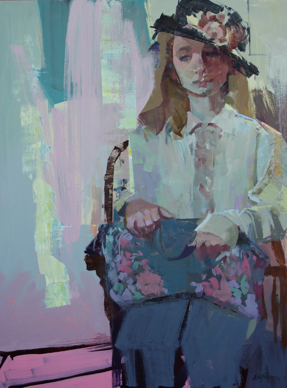
Below is a recent painting I just complete, “Help Wanted”, and the versions that were necessary steps to help me arrive at my authentic point of view.

blog

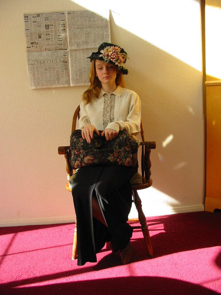
The original photo. What I don’t like about it; the overall yellowish tone, Too much red in the lower section. This could take a nose dive into cuteness or sentiment. These things are fairly easy to overcome. Shift the color balance cooler and crop in the lower section. The sentimentality is going to be a conscious effort to not fall into what I’ve seen before.

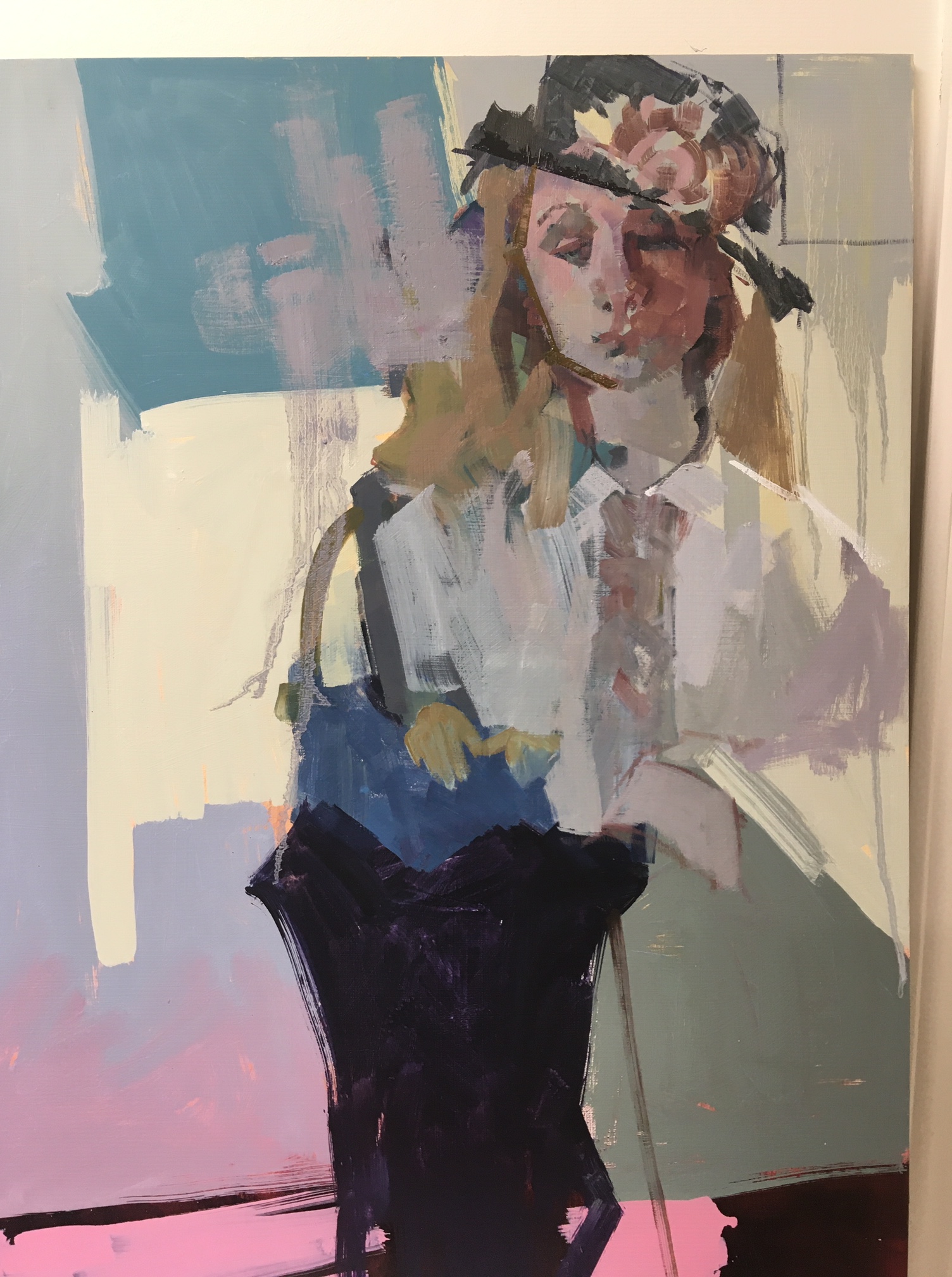
Now for the really important stuff… what do I like, or why would I want to paint this, what’s my point of view? Looks like this you girl is waiting to be interviewed for a job. There is tension in her hands as she grips her purse, ( at least in one hand, I’ll have to re-gesture the other one) . Her face is tense and listless at once. Her blouse is a little too big maybe borrowed from someone, the hat sits at an awkward angle. Obviously not something she has worn much.

I’ve been there! Wearing uncomfortable “dress-up” clothes,trying to get a job, feeling in a trance because the Manager was too busy with important stuff to give me the time of day. An uneasy situation for sure.dan111

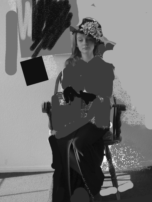
Above, exploring my options. I could give her a dark jacket and gloves, add something dark to the left. Taking the color out of it, turning it to pure value can help with design decisions. How am I going to fill the space in an interesting way?

ver3

At this point I reconnected with my purpose and it was not working, why? The attitude of the hands and expression in the face were lost. The ground and her skirt were more interesting, not my intention. What do I do now?

Could put it in the failed paintings pile and move on to something else…or….really learn something and figure out how to turn it around.

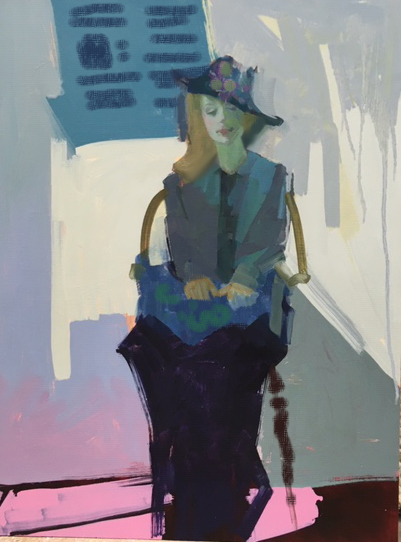
She needs to be bigger in the story, crop in closer to really see her face and hands, Back to the light blouse and hands with no gloves, just attack it and make it behave!

IMG_3977

The beginning of the “right” thing over the “wrong” thing”. It’s a little confusing to just paint over something else, but makes you realize, this is about you, you can do anything you want to, that’s freeing!

helpwanted-lr

This is what I wanted to say, my point of view. There could be hundreds of others, but this one is mine.


Moving Away from Literal

After many, many years of painting I have found the paintings that have been the most successful are the ones where the actual subject was the spark and my imagination was the flame.

Often before starting I will sit down with paper and pen with the goal of getting to the core of why I want to paint this “thing”;

Design questions-

  • Does it exhibit any value patterns that have a wonderful rhythm?
  • What type of paint handling would make this subject really sing?
  • Is there an overall shape that is fascinating?

Emotional questions-

  • Does the subject have an expression that can be exagggerated to heighten the story?
  • What does this mean to me personally ?
  • What can I delete that is just distracting ?

When I finally arrive at my focus, I can start painting.

Dan-lr

My answers to these questions when I chose this image.

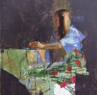
  • I’m going to take advantage of the shape of the girl and table as my interesting medium & light value pattern against everything else as dark.
  • More controlled paint handling, big smooth areas against small rough ones.
  • The shape of the girl attached to the table is the glue that holds this together.
  • There is a mood of extreme stillness, am going to use all my horizontal and vertical lines as strongly as possible.
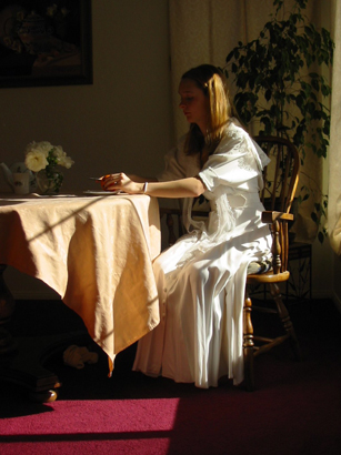
  • This was a daughter of a friend, borrowing her mom’s wedding dress for the photo. Her personality was anything but Victorian and was feeling ill at ease in this dress. So there was a kind of tension at the time which I’d like to express.
  • Don’t like the potted plant, the murky green of the top half or the red carpet, note to self, push everything to the cool side, get rid of that plant!

dan-wrok

As you can see I painted this over another painting, sanded first, to remove any high spots.

The best way to start is going right for the key area, the large shape made by the girl and the table cloth. I’ve found that expressing what I want to say , ( not the literal photo reference), correctly, leads me to the next part and the next, etc.

Roughing things out loosely seems a waste of time, nothing is the right color, shape or place, how does this help? Better to get a few things nailed down, than work out from that point. After the important statement is made, you might be surprised how how little else needs to be said, I’m talking about useless details. Spend 90% of your time on 40% of the painting, it can free you up to experiment more!

sitting-lr

Here is the finished painting “Two Worlds”.

3 Ways to Energize Your Painting

Running a cash register, practicing scales on a piano or . . . painting. Doing anything over and over for a long period of time can lead to boredom. When you are bored while painting, your audience will also be bored when they look at it. Yes, complacency blows the spark out. On the flip side, when you are invested and mesmerized by what you’re working on, it can’t help but permeate into your work.

When I find myself in this comatose state here are three things to try:

1. Start a painting with no preplanning. I know after years of talking about value plans, color sketches and dynamic symmetry grids have I lost it? No, if you have been doing this preliminary work, good for you. It’s all part of the virtual tool box in your head, now give it a test. Start with a subject, grab a charcoal or paint brush and get it down, shape by shape. Not sure about the color? Get it on there, stop every 30 minutes of so, evaluate, make adjustments and go on.

2. Start a new painting on top of an old one. When beginning a painting on a white canvas it can be hours until something exciting emerges. Using a old painting as your underpainting is like a head start. Don’t dwell on which one to use for the new subject, those colors that don’t exist in the new subject could be just what it needs. Below are two old paintings, with the beginnings of a new one.

IMG_3518IMG_3505

3. Be patient with your next painting. I like to work on two or three paintings at once. This is a great way to not rush toward “finishing” a painting. As I get tired or, god forbid, bored, with a painting, I turn it to the wall, pulling it out in a couple days. What’s the rush anyway? There are very few fantastic paintings that are rushed right through, beginning to end. I ask myself “what does it need, to be it’s best self?” It may be, I need to get rid of something, too many values, or colors. Training your eye, getting away from it helps to depersonalize. Pretend someone else painted this and asked you what to do next? The painting below took many sessions of minor adjustments that just couldn’t have been banged out in a couple days. Would you rather have a few successful paintings that took some time and patience or a closet full of “just good enough” ones.slowlight-lr

What makes the “right” frame?

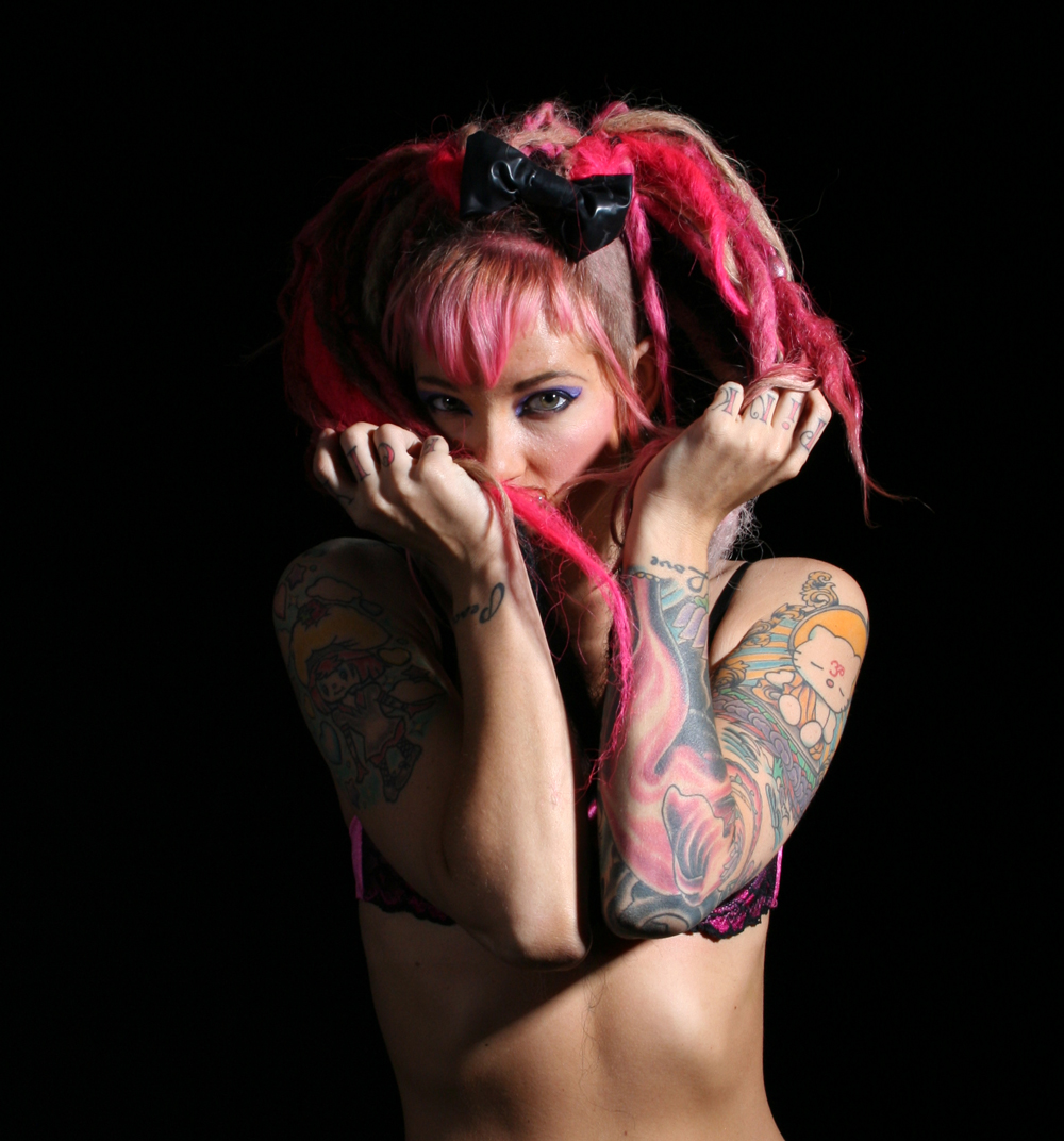
Several years ago I went to an unusual event. Models were hired by a local photography studio, and all those who had a digital SLR camera could take pictures for a price.

Ten or so of us stood in line for our turn at five minutes with the model. This meant directing her while using the props and strobe lights that were available in the space.

blog1frame

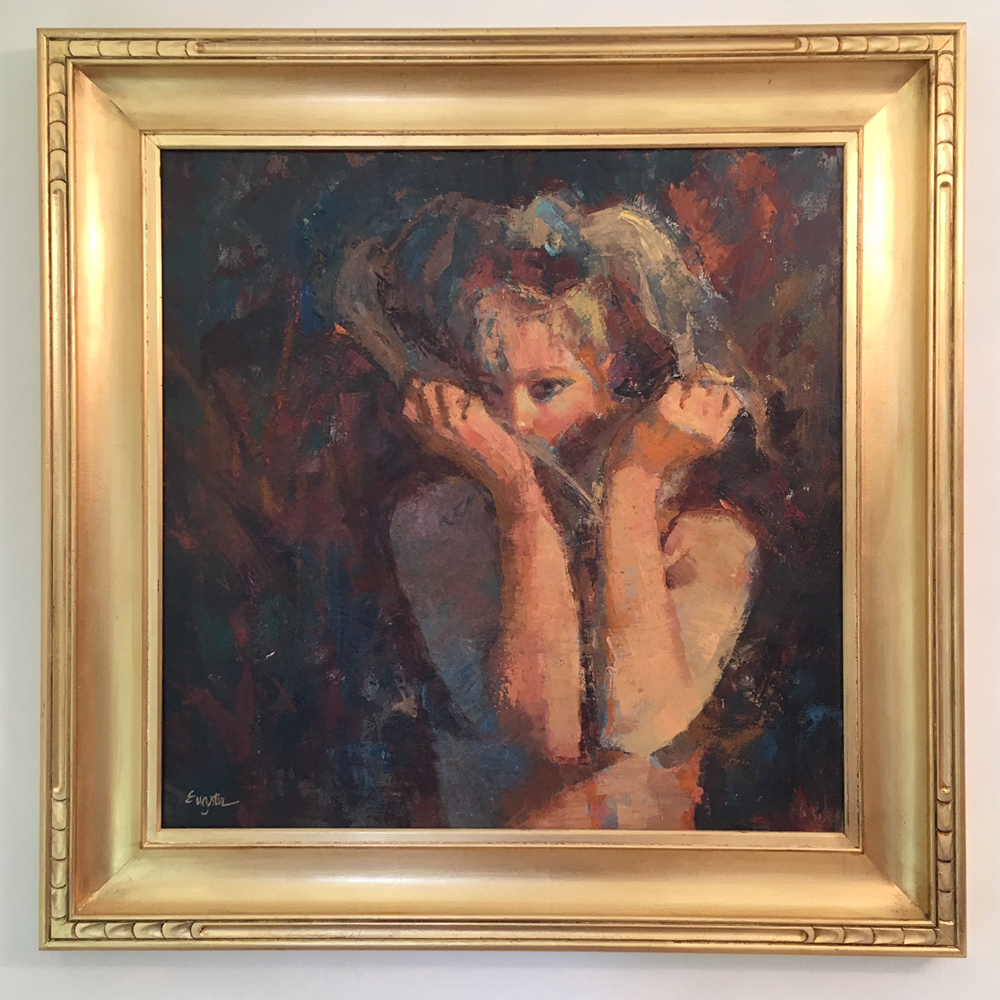
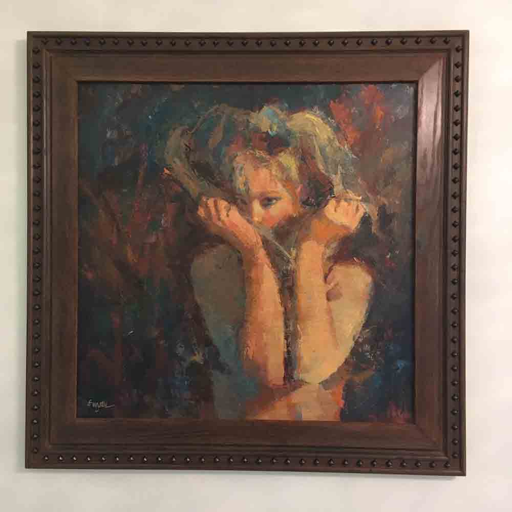
This young woman stood out with her pink dreadlocks/shaved head hair style, heavy makeup and cartoon tattoos . I sensed that under all the distractions there was a whole other girl, so that’s the girl that I painted.

goldframe

For a long time this was the frame on the painting. When I took it out the other day it was clear this was not a good choice. Why?

These are the things I look at now when choosing a frame;

-What is the dominant temperature? Warm, which the gold frame is . . however

-What is the largest area of color (or dominant color), medium size color, accent color? Dark brown, orange and gold, some blues (in order). This is the problem

By putting a gold frame on this, it is adding way more gold to the overall image, making gold no longer an accent in the piece, and throwing the balance in the painting off.

Also the bright gold next to the dark background makes it hard to see the subtle darks, the eye just can’t get past the jarring move from light gold frame to dark background.

IMG_2641

My husband John made this frame for her that is so much better. This ebonized Red Oak, dark wood frame enhances the colors in the background, while the nail head trim matches the edginess of the subject.

The next time you choose a frame, ask yourself if it continues with the balance you’ve developed, being a supporting cast member, or is it screaming for attention over your subject.


One Subject, Two Times

Have you ever painted a subject, only to end up with something that was almost there…but not quite?

This is one of those subjects.

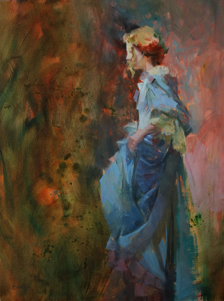
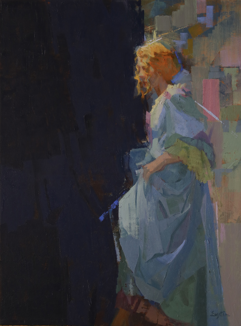
What was it that made me want to paint this scene of a young woman in an 18th century dress?

  • The idea of a traditional subject painted in a contemporary way intrigued me.
  • The possibilities of a strong design, with the tall vertical girl pushing horizontally into the large dark space to the left.
  • The colors, I’m always drawn to blues, greens and violets.

The first painting seen belowUnknownFinalImagelr

I like the division of space into a variety of shapes. I like the background texture; but is it too different from the subject. The girl  has very linear strokes and marks, the background more gauze like. The colors in the background are too warm on the left and too pink on the right. Which means they don’t relate to the girl. So there is a kind of disconnect here.

unkowblack-lr

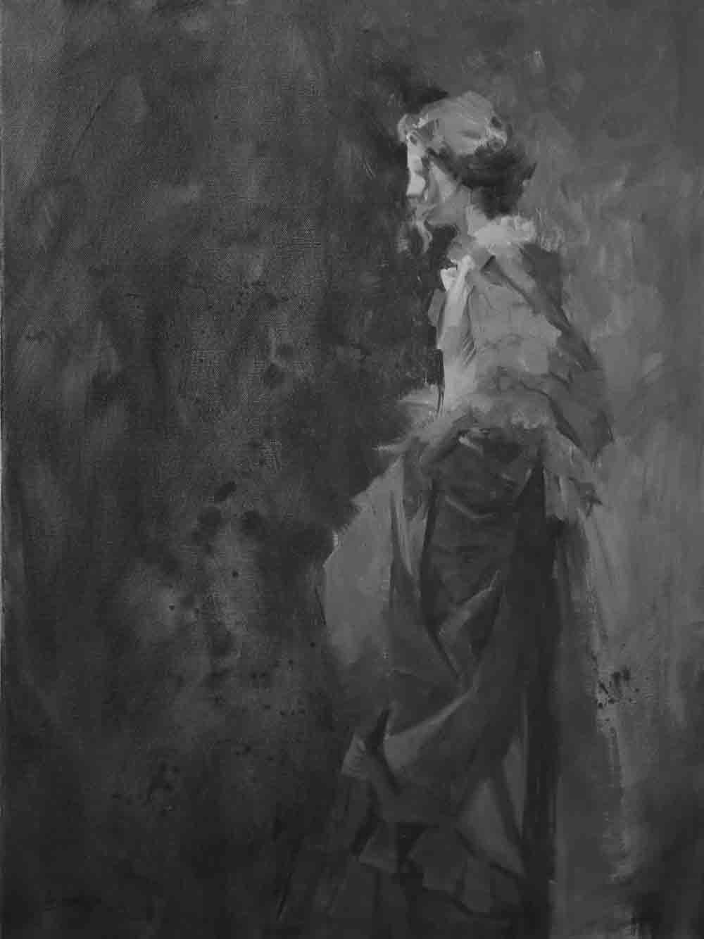
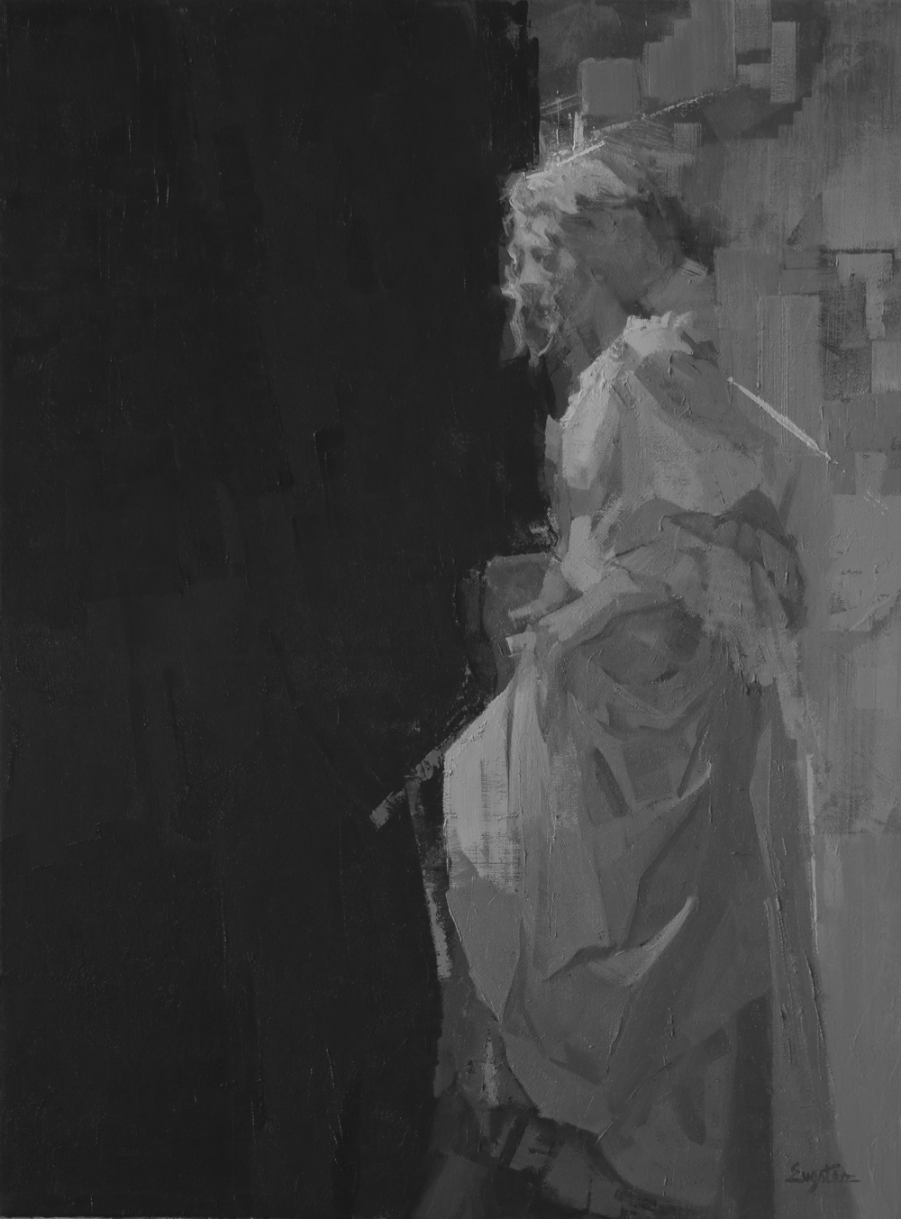
Looking at a painting in grey scale (black and white), always helps me to see why things didn’t work out.

What I want to see are dark areas that are connected. As you can see in the skirt area, they are too scattered, while the dark shape of the bottom of her hair is too isolated from the other darks. It doesn’t matter if this is how it really looked, it is our job to change things to make a better visual statement.

The light areas should be around the center of interest, her face, and they are, but the shapes just aren’t interesting enough.

elJalesco-lr

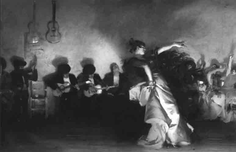
In this painting by John Singer Sargent notice how the darks are connected and hold together across the painting, he was a master of value control.

The final version below-Unknownfinal2019-lr

This version is more of what I was looking for. The background shares tints, tones and shades of the blues, greens and violets of the dress in both the lighter right side and darker left side.Unknowngrey2019-lr

In this grey scale of the painting the darks are a solid shape on the left with an interesting edge as it meets the tall vertical of the girl. The lights are also more interesting and descriptive.

It took a year and a half to realize what needed to be done, be patient, your eye will tell you what to do eventually,


Simplify and Exaggerate

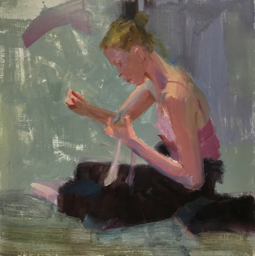
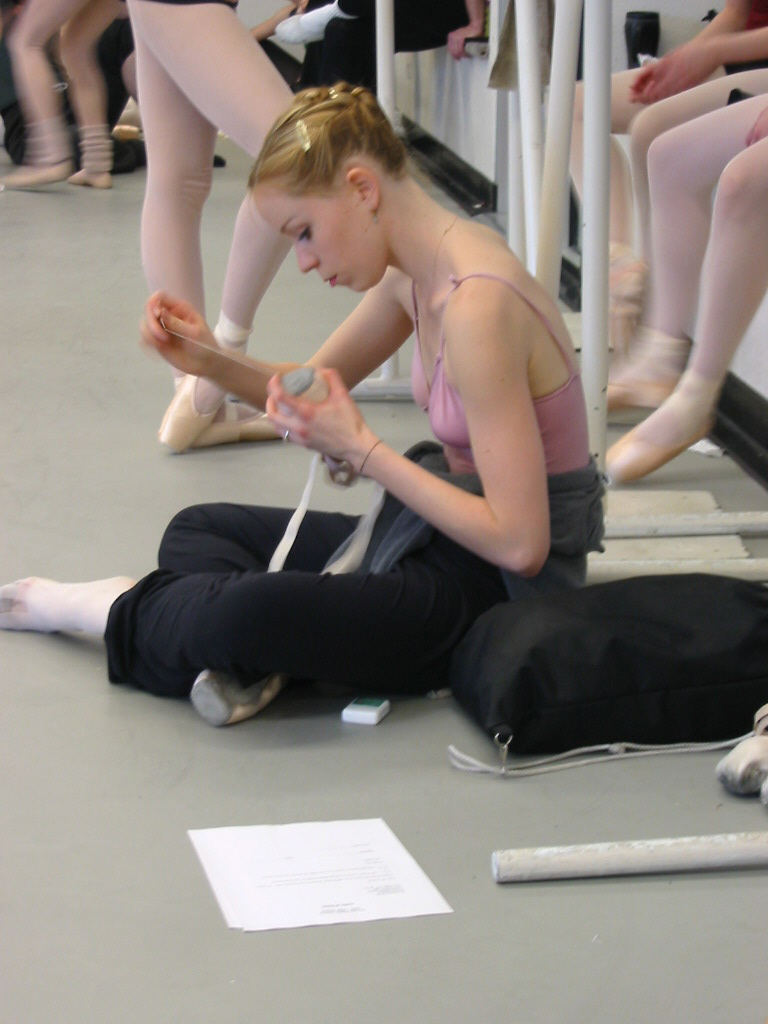
BalletcropblogThis is a image I’ve had for at least seven years, in fact it was painted once before.
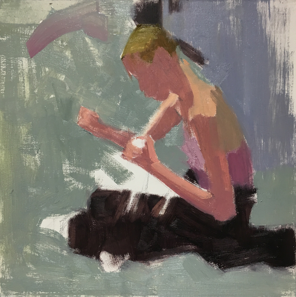
It’s fun to come back and see how your eye for design has changed. The first time around I saw it as ; lacking color contrast (in the flesh tones) and having a weak composition.

The key is to simplify and exaggerate. Keying in on the simple shapes means grouping things together, even if they don’t look like anything, that might be alright or they may morph into something that is recognizable later.blog-shoe1

I chose a square format and starting with anchoring dark shapes to the top and bottom,  focusing on a triangular design. It’s always good to have the center of interest attached to  an edge so that it doesn’t appear to float in the space.blo-shoe2

At this point it’s more about deciphering the light condition. This took place in a large rehearsal room with lots of overhead lights plus more light coming in large windows. No wonder things appeared washed-out, but looking closer reveals how the light is showing the form, like on the top plane of her back.

All that clutter on the right is reduced to a violet patch of color. blog-shoe3

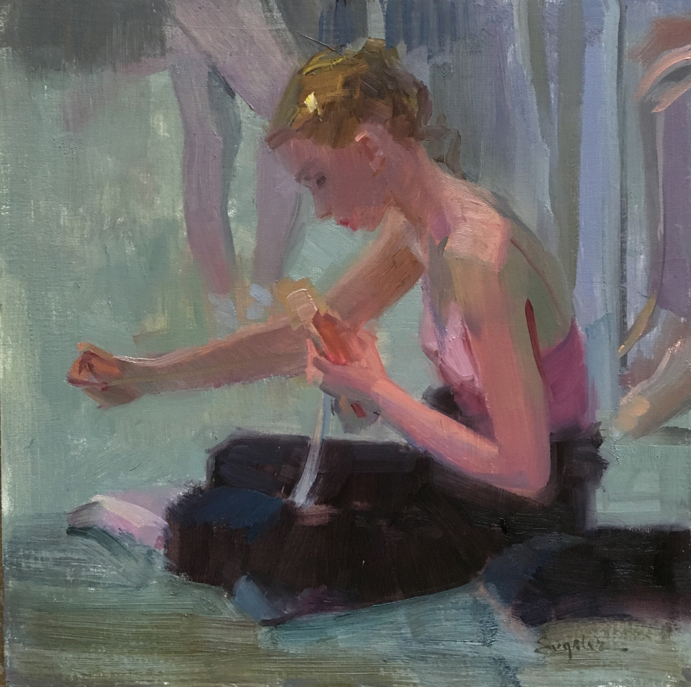
Here, all the areas have been generally massed in and decisions need to be made.

  • First, do I want to bring back some of the information in the background? Yes, it will help with the story to give some clues about her surroundings.
  • Is there anything that doesn’t help the story or composition? Yes, her distant arm bend is a tangent with the foreground hand and shoe she’s holding. Speaking of the shoe, it doesn’t read well as a shoe, could I edit the shape to make it more shoe like?blog-shoe4

I like that arm outstretched more, plus the shoe and distant ballet information simplified!