

How does getting stuck while painting happen?
You choose an image that grabs your attention, begin the painting, only to find a brick wall in your way. It’s hard to move forward, almost as if there is a road block.
In a perfect world that image has a good composition, dazzling color harmony and a fascinating subject, so all you have to do is paint it the way it looks. But the problem is, most images don’t have all these things, so you need to manipulated somewhat, be creative.
Getting caught up in interpretation; what style should I paint this, what colors should I use, can be exhausting, in other words, too many choices. When paintings go “off script” more a personal statement than a literal one, the payoff is a more meaningful piece which is much more rewarding.
Recently I was working on an image that evoked a certain emotion response in me, maybe it was the boho, the free spirit or the 70’s? Not very far into this and I hit the road block. I just didn’t know what direction to take, so I fell back on painting what I saw, (which was not the the vision that I felt)…make sense? The more I painted academically, matching what I saw, the further I got from my vision.
When this happens, a push forward is needed.
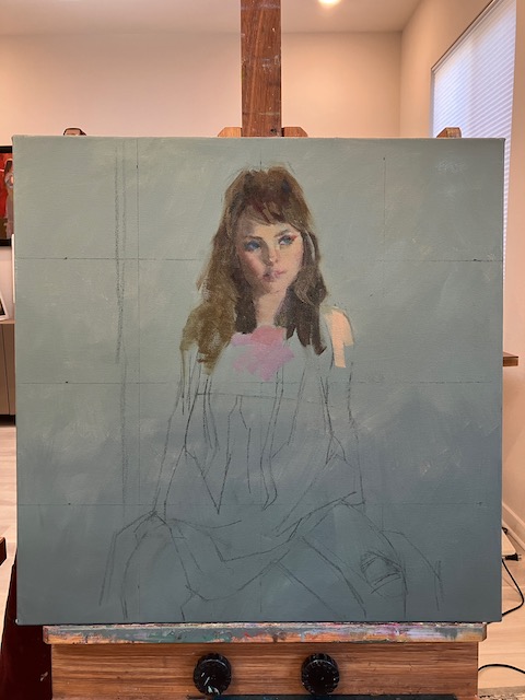
The first move to get unstuck is pick an area to start with. Here, it was her hair, which was dull and lifeless, (my model did not have lifeless hair, just my painting at this point). With a palette knife I mixed three piles of paint. One for the light, medium and dark value of the hair. These piles need to be enough paint to really load a brush.
Next I picked up an uncomfortably large brush.


Now going against conventional wisdom I painted the area from light to dark with a minimum of large loose strokes. Things started looking a little more interesting. The colors don’t have to be “right”, but the values (amount of dark or light), do. Just get the paint on, you can always go back later and tweak the color.
Move on to the next adjoining area and do the same.

Here I moved on to her top. This area could be summed up by one value of a pinkish tone. By mixing this pile next to the others on the palette it becomes easier to get a harmony between them. A pink was way too intense, so by adding this murky olive green mixture to the pink I arrived at a duller version that was in harmony with the rest.
As a side note, there is not such thing as a dirty color, if subtle tones, like these are in harmony with the ones next to them a wonderful visual richness can happen. If a bright pink was used next to the other tones here, the pink would look garish and the subtle tones would go dead.

Continuing to move down the painting I found myself “unstuck” as one area told me what the next needed to be. The arm on the left in shadow was close to the color in her hair. If there is any color already in the painting you could possibly use for another area, use it. The arm on the right was similar to the the tone of her face, repeat it.
Working through the image one large chunk at a time, the image begins to solidify and come together. The ideas here is, the more right things that materialize on the painting the easier it is to see the wrong things. When I say wrong things, I’m not talking about what’s in the original image, but what is out of harmony with what’s on the canvas. Don’t be scared to put something down “wrong”. Changes will need to be made, but can’t be unless there is something down to evaluate. The right passage of color over the wrong passage can be very exciting!


