Letting Paint Be Paint

This Moment by Diane Eugster

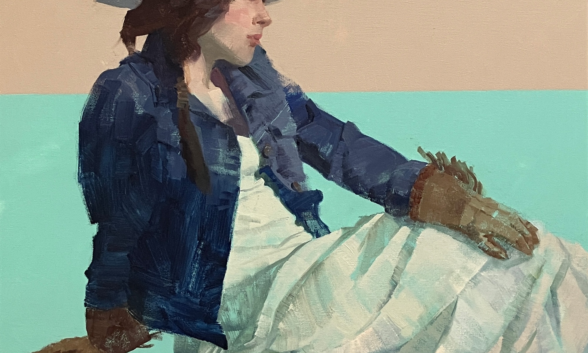
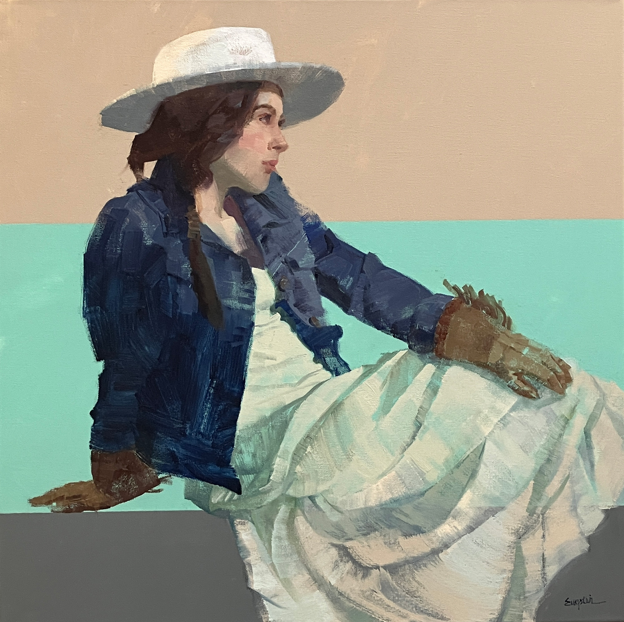
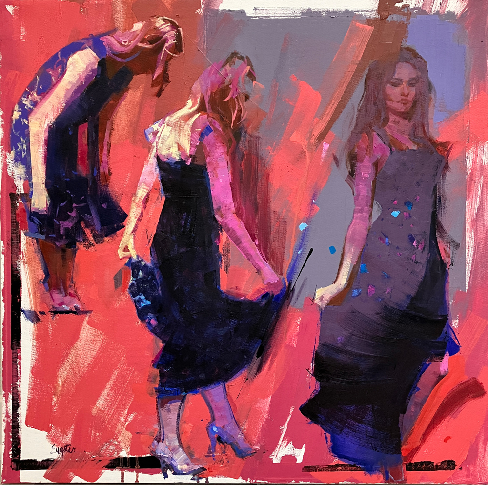
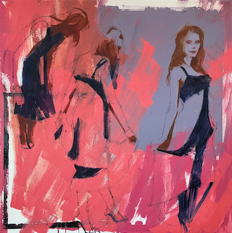
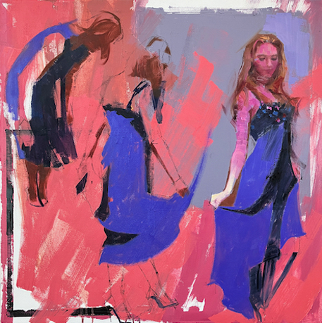
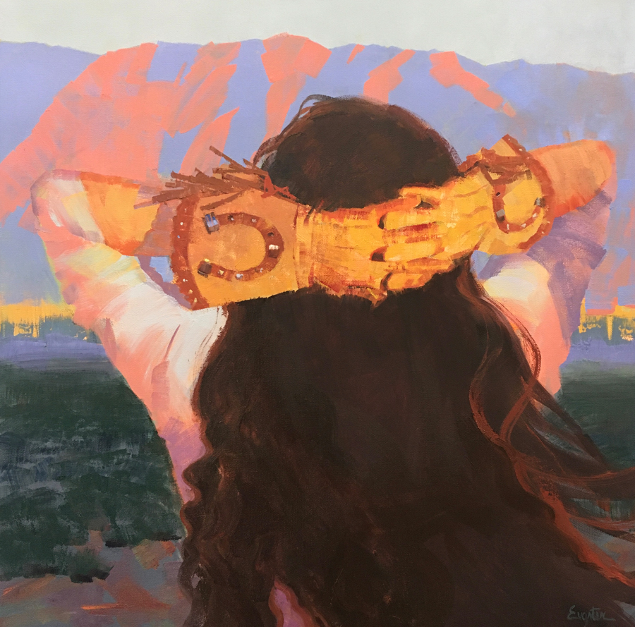
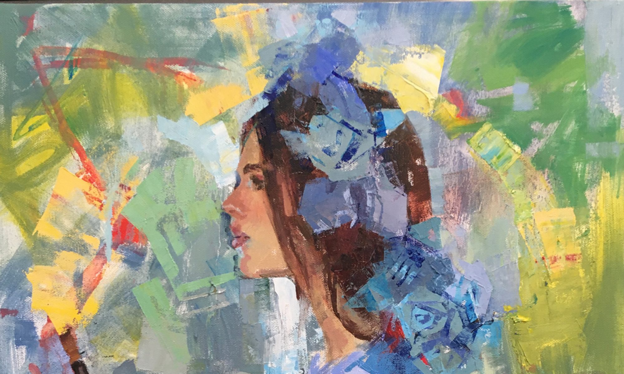
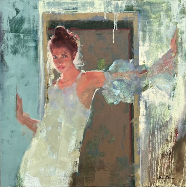
The longer I paint, the more I realize that the really exciting things that happen are when I let go, intentionally lose control.

What do I mean by intentionally loosing control? Not forcing the paint to look like a literal thing; like a door, a flower, an arm. This is where drawing skills are very important. When suggesting “things” and not painfully rendering them, bits of truth need to be sprinkled around (accurate drawing).

Getting emotionally involved with your painting helps to initially discover a direction. No, just throwing paint on the canvas isn’t a direction. How do you want it to feel, the mood.

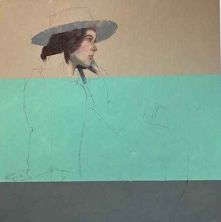
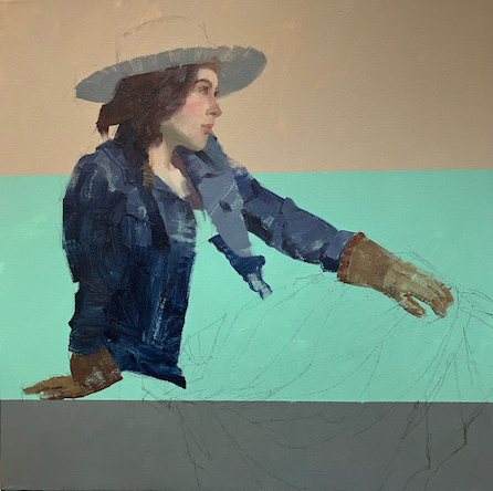
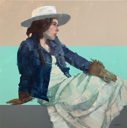
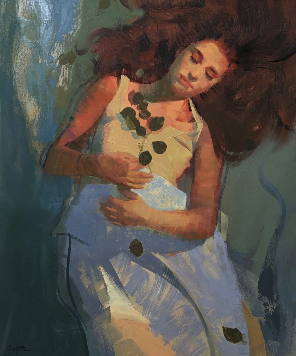
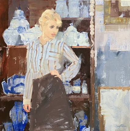
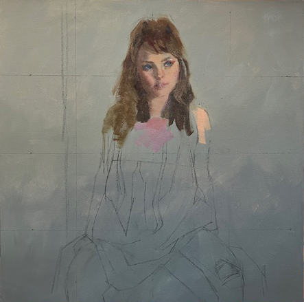
Paint can do some wonderful things when given a little encouragement, then backing away. Beginning the painting with a underpainting gives a base to start with. I use colors that work with the subject, a warm painting with a warm underpainting or something that works against it, a cool underpainting with a warm painting, which is what I usually choose because I think it’s exciting to see little pieces of the wrong thing showing through the right tones.

Here are just a few of the techniques that can help you to intentionally loose some control;

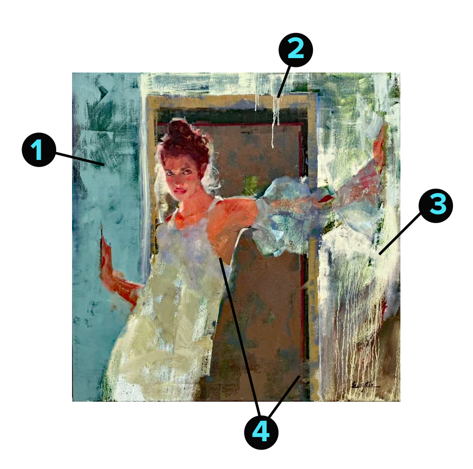
  1. Dragging a lighter value paint over a dried underlayer with a 4″-6″ metal trowel. I sometimes use a ripped out magazine page to mask areas I don’t want effected or just wipe away if it lands somewhere that doesn’t look right.
  2. Stuff just happens when you’re working on another area, don’t automatically make corrections.
  3. Apply paint with a heavily loaded uncomfortably large brush, than lightly dab with turpentine, see what happens…
  4. Fold a paper towel into a trowel shape and swish some hard edges.

These are several ideas which can be built on in many ways. The main thing is starting first with some kind of base tone. Not a lot of inspiring things happen on a plain white canvas. Letting some layers dry before adding more is suggested, otherwise a slippery dull surface can ensue which can cause frustration. Working on several paintings at once will allow some to dry up while you’re approaching another.

That was Then

This is a subject I find myself revisiting many times over the years. Why? That is the million dollar question that the success of the entire painting hinges on. Reflecting on the right answer is definitely worth the time.

Some of the wrong answers might be;

  • Because it’s a “pretty” subject
  • I heard that western art is selling right now
  • My friends think this would be a good subject for me
  • I like the colors

My answers; (this is a person thing, it could go in many directions)

  • This reminds me of the wide open, arid landscape of the southwest
  • Honesty and integrity
  • Relaxed, sans-tension
  • A simpler time

The problem is how to express these things in paint.

I decided to divide the canvas into a graphic representation of the earth and sky with three horizontal zones. To keep the triangle composition, (which says honesty and integrity), I let the background dry completely before starting the figure.

The expression on her face was very important, not what she looked like, but what she seemed like. The face set the mood for everything that followed so I worked down from there.

I used a primary palette of Ultramarine Blue, Alizarin Crimson, Hansa Yellow and White, I find mixing the paint with Oleopasto gel gives it the body for textural effects as well as spreadability without getting too liquid. Using as few values as possible with an eye on interesting shapes, I work down the jacket, Knowing I’ll be going back for a second pass of texture and some details later.

At this point when everything is laid in, is the most important of all. Moving from the top down I start assessing everything for possible things that could hold the painting back from its full potential. I’m not looking for how the subject differs from the original reference image, because I have changed a lot of things for the good of the painting while working through this. What I’m looking for are errors in perspective, tangents, design choices that went astray, colors that are not harmonious with the whole. And is there anything working against my original intent.

  • The perspective on her head as it hits the hat is incorrect, it needs to be more rounded.
  • The value of her nose is a little too dark.
  • The glove on her knee needs a shadow to give it some weight.
  • Rework the flow of the skirt, not moving the way I want it to.

The finished painting “That was Then”

Developing the Idea

I’ve been asked how I develop the idea for a painting. Here is the process I went through in a recent one.

Finding a subject that resonates with me in my reference photos is the first stage, photo #1. I liked the gesture of her stance and the way the light is falling on the right side. I will replace the background barn and the foreground gravel, I want to tell a different story about her.

Photo #1

Than fleshing it out, how can I made this scene more of what I want to say? The photo on the left below, shows a cropped section of grass from a painting I did several years ago, (you never know when those old paintings will come in handy), which seemed a good environment for her. I’ll be omitting the barn and mountains in the back, just wanted the grass texture. Also it seemed a tractor would add to the story I want to tell, ( decided to use a red one instead of the yellow and red).

Putting them all together, it’s beginning to work. Notice how I cropped the figure in closer. A close cropping makes for bigger, bolder shapes, as well as focusing on what I feel are the most important parts.

For the first stage of this painting I decided to put a wash on the painting surface. Why? The glow of a colored wash on a white canvas can only be accomplished at the beginning. I’d like this glow to show through in small areas as the top more opaque layers of paint build up. I chose to use an orange tone under the green field area to add warmth, because green can sometimes be problematic as a raw cold color. In the area on the girl, I washed on a warm green because in real life the green in that field would be reflecting all over her. Also it creates a harmony within the painting. See the video below-

Diane, applying the initial warm wash on the canvas surface.

To be continued in part 2. . . . . . .

Evolution of a Painting

Drifting

Have you ever “finished” a painting, than weeks later , saw that you missed the original idea? That’s what happened with Drifting, the painting below.


I was really excited about this image, my thoughts exploded in all directions.

  • I liked the vantage point from above, wanted a – floating, drifting, sleeping feeling.
  • I liked the intense warmth, wanted to manipulate this from warm at the top to cool at the bottom.
  • Wanted her to exist in two worlds, one of reality and one of graphic design.

Any one of these would have been interesting, but all of them at once was too much. There were parts of the painting that I really liked; her face, hair, warm light, the composition. However I got lost along the way, the relaxed flowing atmosphere I had originally pictured was not there. So how did I go about bringing it back?

First deciding what needed to change.

This is a breakdown of the areas that needed the most changes.

  • #1, shows where the color transition from warm to cool needs to be fixed. Because of the way cool colors recede, she almost looks like she is bent forward at the waist. The change is too stark, some cool would be good in the lower half, but this is too much.
  • #2, the hands- the most important area after the face that will show the mood of the painting. The gesture of these hands is too tense. Don’t always accept what you are given, change anything for the good of the painting.
  • #3, the folds are too angular, they do not fit with the idea of flowing.
  • #4, the leaves are clustered in a stiff pattern, again, not the flow I had in mind.

The final version. I haven’t touched her face yet her expression looks more relaxed. You can see how I tweeted the background color and movement. Now she appears to be floating above the ground, I see the view like something out of an airplane window.

Recent Painting, Shop Girl

Thought I would write about a recent painting “Shop Girl” I just completed. When John and I lived in Scottsdale we met a lovely lady who owned an eclectically beautiful little gift shop in Old Town Scottsdale.

She was kind enough to let me use her store as a richly textured backdrop for a vintage photo shoot. There were so many chandeliers, tapestries and ceramic vessels I didn’t know where to start.

I chose this particular scene because of the gesture, interesting shapes and open ended story it told.

Below is a video link to some excerpts along the way-

End of 2023 ..Beginning of 2024

Below is a video reviewing some of my paintings from 2023.

I’ve never been big on New Year’s resolutions, but I think it is a good thing to stop at some point and look at what you’ve done, where you are and where you’d like to be. I guess the beginning of a new calendar year is as good a time as any.

The past year I have worked to simplify all the parts of putting together a painting, so I can focus on really digging into the subject.

As you may know for years I’ve been using a limited palette of Ultramarine blue, Permanent Alizarin, Hansa Yellow and Titanium White. Doing this has forced me to learn every personality trait of these colors. Kind of like being married to someone for 25 years, and I am talking about a good marriage, (thank you, John).

I’ve also limit my brushes to mainly flats in nylon and hog bristle. I like my brushes to be slightly worn for the textures that appeal to me. I don’t like to soap and water, clean my brushes, but I use them often and rinse them with turp . I buy large quantities of brushes and throw them away when they get unworkable.

Sometimes as painters, I think we rely on a certain way of moving the brush to describe things in our work. I will be experimenting more with different types of mark making and just letting paint be paint.

I have a show coming up in November that will involve masks, so stay tuned.

Thank you for your friendship and support this year! -Diane

Click this link to see my end of the year recap video 

How to Get Unstuck

How does getting stuck while painting happen?

You choose an image that grabs your attention, begin the painting, only to find a brick wall in your way. It’s hard to move forward, almost as if there is a road block.

In a perfect world that image has a good composition, dazzling color harmony and a fascinating subject, so all you have to do is paint it the way it looks. But the problem is, most images don’t have all these things, so you need to manipulated somewhat, be creative.

Getting caught up in interpretation; what style should I paint this, what colors should I use, can be exhausting, in other words, too many choices. When paintings go “off script” more a personal statement than a literal one, the payoff is a more meaningful piece which is much more rewarding.

Recently I was working on an image that evoked a certain emotion response in me, maybe it was the boho, the free spirit or the 70’s? Not very far into this and I hit the road block. I just didn’t know what direction to take, so I fell back on painting what I saw, (which was not the the vision that I felt)…make sense? The more I painted academically, matching what I saw, the further I got from my vision.

When this happens, a push forward is needed.

The first move to get unstuck is pick an area to start with. Here, it was her hair, which was dull and lifeless, (my model did not have lifeless hair, just my painting at this point). With a palette knife I mixed three piles of paint. One for the light, medium and dark value of the hair. These piles need to be enough paint to really load a brush.

Next I picked up an uncomfortably large brush.

Now going against conventional wisdom I painted the area from light to dark with a minimum of large loose strokes. Things started looking a little more interesting. The colors don’t have to be “right”, but the values (amount of dark or light), do. Just get the paint on, you can always go back later and tweak the color.

Move on to the next adjoining area and do the same.

Here I moved on to her top. This area could be summed up by one value of a pinkish tone. By mixing this pile next to the others on the palette it becomes easier to get a harmony between them. A pink was way too intense, so by adding this murky olive green mixture to the pink I arrived at a duller version that was in harmony with the rest.

As a side note, there is not such thing as a dirty color, if subtle tones, like these are in harmony with the ones next to them a wonderful visual richness can happen. If a bright pink was used next to the other tones here, the pink would look garish and the subtle tones would go dead.

Continuing to move down the painting I found myself “unstuck” as one area told me what the next needed to be. The arm on the left in shadow was close to the color in her hair. If there is any color already in the painting you could possibly use for another area, use it. The arm on the right was similar to the the tone of her face, repeat it.

Working through the image one large chunk at a time, the image begins to solidify and come together. The ideas here is, the more right things that materialize on the painting the easier it is to see the wrong things. When I say wrong things, I’m not talking about what’s in the original image, but what is out of harmony with what’s on the canvas. Don’t be scared to put something down “wrong”. Changes will need to be made, but can’t be unless there is something down to evaluate. The right passage of color over the wrong passage can be very exciting!

When December Comes Around

When December comes around I find it’s a good time to look back on what I’ve painted the past year, where I’ve been, where I’m going. This is an important exercise for any serious artist if you want to progress.

In the 50 something years I’ve been painting, just about every type of subject has crossed my easel:

Landscapes; like the possibility for textures, openness and nature, but need a person for the emotional impact

Cityscapes: not so much, too many hard lines closing in

Still life: another opportunity for texture, but can’t get too excited about painting things

Seascapes: love the paintings by those that know the sea, but living my life in the desert, I am not one of those people

Portraits; the expressions, the textures, the emotion, it’s all there for me

Figures: like portraits only better, because add hands, feet and wardrobe to the mix to get endless possibilities

What I’m saying is . . . understanding yourself and what really excites you will raise the bar on your skills and enjoyment of painting.

This year I have enjoyed painting more than ever, because I am painting what excites me. . .

Reality to Fantasy and scattered thoughts

Lately I’ve been working on some paintings that bridge reality and fantasy. Thought I would share some of the process that gets me from point A to point B.

It begins with photos I’ve taken of one person in various, but similar poses. Something about them has to have a definitive mood.

Keying in on the mood. . . the theme. . . the brain storming (or scattered thoughts) begin. These are a sampling of the 10-15 images I looked through, what I saw was ;

  • High Fashion
  • Photography
  • Tall
  • Black, Grey, Pink, Flesh tones,
  • Strutting
  • High cheek bones
  • Dramatic lighting

Going back to the above images I pull out three that display the above ideas the strongest. In Adobe Photoshop Elements using the eraser tool, the backgrounds are eliminated so that only the figures remain.

The next step is creating a new blank page the size of the finished painting where I freely move the figures around until I see a rhythm emerging between them.

I throw shapes and blocks of my colors, listed above, black, grey, pink and flesh tones behind them with the goal of connecting the figures with the flow I want the painting to have.

Going back to my list, what elements can I use to strengthen my story? I have a black and white image of a photo edge to incorporate, check the finished painting to see how I used it for inspiration.

Ready to start the painting, the above information is my foundation, my jumping off point, the place where I go when I feel I’ve lost my way in the painting, which can happen with a subject like this, why?

The background will be painted and allowed to dry before I move on to the figures. This can take a week or more. With other paintings happening in between, the original concept can get foggy.

In the beginning stages above you can see I had a totally different idea of what the face on the right should be. It is a very fluid process, I have to be willing at all stages to take some things out and add things, the big question…what does the painting need?

The finished painting “Strut Your Stuff”

The Heart of the Painting

People ask me why I spend the extra time making a drawing before I start a painting, here’s the answer;

The drawing really is the heart of the painting. When I choose a subject to paint I’ve learned that there are some important questions to ask and get answered before investing time and energy into a subject. Keeping disappointments, (failed paintings), to a minimum, is important to my productivity. The more successes, the more excitement to create something else new.

The magic of; a piece of paper, a stick of charcoal and, yes, the trusty eraser have a way of exposing potential problem areas, as well as, areas that might benefit from some exaggeration or down right restructuring.

Here is the original photo

Here is the drawing, after cropping and some creative license

I chose this image from a photo shoot I did six years ago. There have been several similar scenes from the same group I’ve painted over the years. Something about the white dress and sunshine have a timeless quality.

*But why do I want to paint this subject again, is there something to add that wasn’t said in the previous paintings? I want to key in on the delicate quality of the image.

  • Some design questions need answering. What movement and lines can serve as a silent scaffolding to hold up my story? I see the triangle composition in the drawing. Are there some areas where I want tension; yes in her face, yet I want to keep a soft expression. I want the body to be more relaxed.

* I’m not stuck with the colors the photo has handed me, so…what colors would express my feelings? Since I want to feature the delicate cool blues, greens and violets, I will use hot vivid reds and golds to contrast with this. The harsh colors will make the others that much more delicate by comparison.

I will change some of the anatomy shapes to suit the flow of the design I want. Artist John Asaro is a master of this, he twists and turns the human body for his design purposes.

In Asaro’s painting Two Dancers, see how he restructures human anatomy

Seeing where something is “off” in the photo and how I can turn it into an asset can be clearly revealed in the initial sketch. For instance the long lines of her arms in the photo are too stiff, here is an opportunity for some reworking of shapes. In the painting process these things can easily get overlooked in all the multitasking that takes place.

In fact as the painting progresses I will look more at the sketch for the direction to go instead of the original image.

I like to think of the sketch as the “getting to know you” stage. Working through the drawing I discover how important the one strand of hair that falls over her eye is. The shape, value and placement are paramount to her expression (another thing that could have been haphazardly dashed in, on the painting).

At the left above the background has been basically laid in and the face started. This is a good place to evaluate the direction it’s going. Checking back to my drawing, there is a softness to her facial expression as well as body language that is missing. My corrections will be to widen her face slightly as well as round her shoulders for a more relaxed look. Many decision are made going back to the drawing for answers.

The finished painting “Morning Hues”

What if

Many times when I am “finished” with a painting I ask “what if?”

Even before the what if comes the original intent of the painting, the emotional investment, what was the appeal of this image in the first place?

Answer:

  • The motion and movement
  • The feeling of a transition from one place to a better one

So did that happen in the finished painting? No

The original “finished painting”

In the above image see how the pattern in the cape moves upward to the right, so does the leg. But the outstretched arm stops this movement dead.

What if I continue the movement up past the arm, using the same color and a similar texture so that the flow continues as much as possible, minimizing the stopping line of the arm.

On another note is her expression fitting the story? This is a difficult question to answer by anyone but me, because only I know what was intended, but the answer is no.

I want to keep her face loosely painted, so whatever is done needs to be light handed and subtle.

What if…

I lighten the left eye socket slightly, Minimize the black liner under her eye and thicken the eye brow,

Re-shape the light on her nose,

Darken her forehead and bring down the hairline slightly,

Narrow the mouth and turn up the corners,

Extend her hair on the right side,

Now it’s coming around to my original intent. Never hesitate to go back to a painting for revisions if you have some “what if” questions left.

I’ll Fly Away final version and a thank you to my new Las Vegas model Presley King

When a Painting Goes Off Track

How do you know when a painting gets off track? It’s a good thing to stop at the end of every day and critically take a look at what’s going on.

I choose a spot on an empty wall, free of distractions to set the painting. With a note pad and pen in hand the questions start:

What is happening here that’s successful?

What’s happening here that is not working?

The basic laying for A Certain Time of Day

In the early stages of “A Certain Time of Day” my answer to the first question was hard to come up with. It’s not that there was anything “awful”, just nothing successful either. So going back to the biggest question of all, why am I painting this subject?

I like the relaxed moment caught, the nod to western ranch, nature, warm earthiness.

How to get back to the original intent? 

-Add a desert landscape, with an end of the day lighting effect.

-Add some weather, maybe show her hair blowing.

-Warm up the colors.

Starting to get back on track

 Now things are starting to go in the right direction. The distance is set up for a mountain range, (the desert), the gloves are taking on a rustic texture (warm and earthy).

Wanted to add the light effect to the mountain range shape, but didn’t want it to be too jarring or distracting. By matching the value of the warm tone closely to the value of the shadow tone it all held together nicely without jumping out.

 Moving along …darkening her hair so that I could key the value of her gloves. Every piece depends on the piece next to it. 

The green in the foreground had to go, too bright, need to push this area darker and grayer to draw the eye to more important areas. Not sure of the yellow on the horizon, too early to tell, it could look completely different after the arm shapes are established.

Here’s where I can start drilling down on what needs to be done. The best way to describe this is to see my notes. There may be wrong spelling here, doesn’t matter….just get the thoughts down-

The process of self critique

Actually thought I was done here…..nope. So what’s wrong?

  • The left side of her body the edge of her hair on the right and left, all are the same diagonal, this is boring and repetitive.
  • The left side of her body is at a color discord with the background. This would work if they were closer in value, but being opposites; dark blue green against light red orange is not pleasant to look at.
  • The orange in her hair flipping up at the left is too distracting. What is my center of interest? The hands and gloves, the orange against the dark hair is just upstaging my intent too much. Notice how I say my, this is what makes painting such a personal thing. This image could have told many different stories, but in the end this is the one I wanted to tell.
  • The shape of her body on the left is a long boring shape.

This was more my intent, the story I wanted to tell.