That was Then

This is a subject I find myself revisiting many times over the years. Why? That is the million dollar question that the success of the entire painting hinges on. Reflecting on the right answer is definitely worth the time.

Some of the wrong answers might be;

  • Because it’s a “pretty” subject
  • I heard that western art is selling right now
  • My friends think this would be a good subject for me
  • I like the colors

My answers; (this is a person thing, it could go in many directions)

  • This reminds me of the wide open, arid landscape of the southwest
  • Honesty and integrity
  • Relaxed, sans-tension
  • A simpler time

The problem is how to express these things in paint.

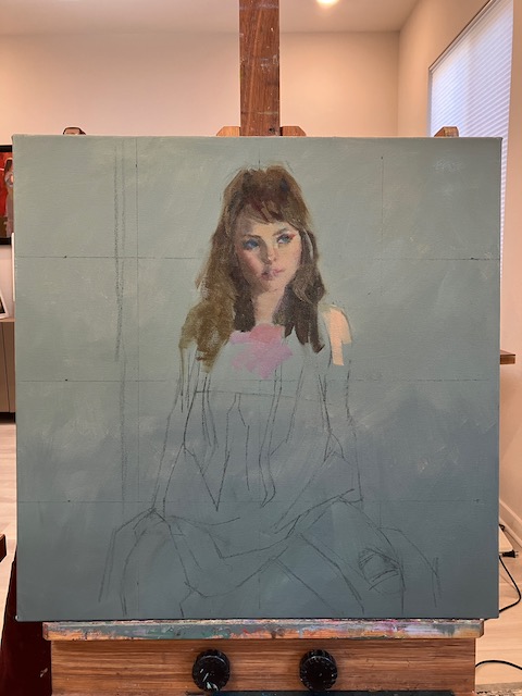
I decided to divide the canvas into a graphic representation of the earth and sky with three horizontal zones. To keep the triangle composition, (which says honesty and integrity), I let the background dry completely before starting the figure.

The expression on her face was very important, not what she looked like, but what she seemed like. The face set the mood for everything that followed so I worked down from there.

I used a primary palette of Ultramarine Blue, Alizarin Crimson, Hansa Yellow and White, I find mixing the paint with Oleopasto gel gives it the body for textural effects as well as spreadability without getting too liquid. Using as few values as possible with an eye on interesting shapes, I work down the jacket, Knowing I’ll be going back for a second pass of texture and some details later.

At this point when everything is laid in, is the most important of all. Moving from the top down I start assessing everything for possible things that could hold the painting back from its full potential. I’m not looking for how the subject differs from the original reference image, because I have changed a lot of things for the good of the painting while working through this. What I’m looking for are errors in perspective, tangents, design choices that went astray, colors that are not harmonious with the whole. And is there anything working against my original intent.

  • The perspective on her head as it hits the hat is incorrect, it needs to be more rounded.
  • The value of her nose is a little too dark.
  • The glove on her knee needs a shadow to give it some weight.
  • Rework the flow of the skirt, not moving the way I want it to.

The finished painting “That was Then”

How to Get Unstuck

How does getting stuck while painting happen?

You choose an image that grabs your attention, begin the painting, only to find a brick wall in your way. It’s hard to move forward, almost as if there is a road block.

In a perfect world that image has a good composition, dazzling color harmony and a fascinating subject, so all you have to do is paint it the way it looks. But the problem is, most images don’t have all these things, so you need to manipulated somewhat, be creative.

Getting caught up in interpretation; what style should I paint this, what colors should I use, can be exhausting, in other words, too many choices. When paintings go “off script” more a personal statement than a literal one, the payoff is a more meaningful piece which is much more rewarding.

Recently I was working on an image that evoked a certain emotion response in me, maybe it was the boho, the free spirit or the 70’s? Not very far into this and I hit the road block. I just didn’t know what direction to take, so I fell back on painting what I saw, (which was not the the vision that I felt)…make sense? The more I painted academically, matching what I saw, the further I got from my vision.

When this happens, a push forward is needed.

The first move to get unstuck is pick an area to start with. Here, it was her hair, which was dull and lifeless, (my model did not have lifeless hair, just my painting at this point). With a palette knife I mixed three piles of paint. One for the light, medium and dark value of the hair. These piles need to be enough paint to really load a brush.

Next I picked up an uncomfortably large brush.

Now going against conventional wisdom I painted the area from light to dark with a minimum of large loose strokes. Things started looking a little more interesting. The colors don’t have to be “right”, but the values (amount of dark or light), do. Just get the paint on, you can always go back later and tweak the color.

Move on to the next adjoining area and do the same.

Here I moved on to her top. This area could be summed up by one value of a pinkish tone. By mixing this pile next to the others on the palette it becomes easier to get a harmony between them. A pink was way too intense, so by adding this murky olive green mixture to the pink I arrived at a duller version that was in harmony with the rest.

As a side note, there is not such thing as a dirty color, if subtle tones, like these are in harmony with the ones next to them a wonderful visual richness can happen. If a bright pink was used next to the other tones here, the pink would look garish and the subtle tones would go dead.

Continuing to move down the painting I found myself “unstuck” as one area told me what the next needed to be. The arm on the left in shadow was close to the color in her hair. If there is any color already in the painting you could possibly use for another area, use it. The arm on the right was similar to the the tone of her face, repeat it.

Working through the image one large chunk at a time, the image begins to solidify and come together. The ideas here is, the more right things that materialize on the painting the easier it is to see the wrong things. When I say wrong things, I’m not talking about what’s in the original image, but what is out of harmony with what’s on the canvas. Don’t be scared to put something down “wrong”. Changes will need to be made, but can’t be unless there is something down to evaluate. The right passage of color over the wrong passage can be very exciting!

The Heart of the Painting

People ask me why I spend the extra time making a drawing before I start a painting, here’s the answer;

The drawing really is the heart of the painting. When I choose a subject to paint I’ve learned that there are some important questions to ask and get answered before investing time and energy into a subject. Keeping disappointments, (failed paintings), to a minimum, is important to my productivity. The more successes, the more excitement to create something else new.

The magic of; a piece of paper, a stick of charcoal and, yes, the trusty eraser have a way of exposing potential problem areas, as well as, areas that might benefit from some exaggeration or down right restructuring.

Here is the original photo

Here is the drawing, after cropping and some creative license

I chose this image from a photo shoot I did six years ago. There have been several similar scenes from the same group I’ve painted over the years. Something about the white dress and sunshine have a timeless quality.

*But why do I want to paint this subject again, is there something to add that wasn’t said in the previous paintings? I want to key in on the delicate quality of the image.

  • Some design questions need answering. What movement and lines can serve as a silent scaffolding to hold up my story? I see the triangle composition in the drawing. Are there some areas where I want tension; yes in her face, yet I want to keep a soft expression. I want the body to be more relaxed.

* I’m not stuck with the colors the photo has handed me, so…what colors would express my feelings? Since I want to feature the delicate cool blues, greens and violets, I will use hot vivid reds and golds to contrast with this. The harsh colors will make the others that much more delicate by comparison.

I will change some of the anatomy shapes to suit the flow of the design I want. Artist John Asaro is a master of this, he twists and turns the human body for his design purposes.

In Asaro’s painting Two Dancers, see how he restructures human anatomy

Seeing where something is “off” in the photo and how I can turn it into an asset can be clearly revealed in the initial sketch. For instance the long lines of her arms in the photo are too stiff, here is an opportunity for some reworking of shapes. In the painting process these things can easily get overlooked in all the multitasking that takes place.

In fact as the painting progresses I will look more at the sketch for the direction to go instead of the original image.

I like to think of the sketch as the “getting to know you” stage. Working through the drawing I discover how important the one strand of hair that falls over her eye is. The shape, value and placement are paramount to her expression (another thing that could have been haphazardly dashed in, on the painting).

At the left above the background has been basically laid in and the face started. This is a good place to evaluate the direction it’s going. Checking back to my drawing, there is a softness to her facial expression as well as body language that is missing. My corrections will be to widen her face slightly as well as round her shoulders for a more relaxed look. Many decision are made going back to the drawing for answers.

The finished painting “Morning Hues”

Taking it Further

Many times when painting a subject from life there just isn’t enough time to finish, or quality control starts to diminish when “artist fatigue” sets in.

The next day, back in the studio, armed with some photos, one taken a little overexposed to see what’s happening in the shadows and one underexposed to see what’s happening in the lightest areas, it’s time to take a hard look. This is one of the greatest ways to develop a keener eye.

So, how do I take it further? Writing down what I like so far;

  • The strong sense of light on her face, an almost stark quality
  • The composition

Now, what could elevate this, if I saw a more advanced version of this painting at an art show, what is it that would make me stop and look?

  • Correct any drawing/value problems that would take away from the whole
  • Work the edges to lead the eye around the painting and not distract
  • Play up the textures1920rough-lrI began in the studio at this point-

1920-final-lr

After taking it further with the changes below-

Drawing problems;

  • her left hand and right hands- needed reshaping and softening
  • her left arm, take the value lighter and reshape
  • her knee, not in the right place
  • chin, a little more pointed

Opportunities for texture

  • highlight on her headband
  • shine on her dress
  • fur and sparkles on coat, right side
  • background needs a little more chroma
  • work items on table for more interest

In the beginning when trying to “taking it further” it may seem hard to spot what you need to do, but keep looking with a critical eye and you will soon develop a knack for seeing which direction to take.


What’s The Point?

When sitting (or standing) in front of a new subject my first consideration is what’s the point? Why am I painting this thing, because it’s there is the worst possible reason. I’ve got to have a point of view, a motive for lifting the brush to the canvas.

My subject; a young woman with ringlets, red hair and a period dress, sitting stoically upright in a chair. The obvious road to take; a somber earth tone palette with quiet softened edges. My motive, to not paint it this way.

How about a primary limited palette of Alizarin Crimson, Ultramarine Blue and Cadmium yellow. This choice could help to keep the color lively even in the flesh tones. wedge1-lr

The initial block in, pushing the color – maybe too far, but I can always take it back later if needed. Separating the dark from the light, which is important for holding on to the form.wedge2-lr

At this point I’m starting to discover the color world she will be living in. It’s now a mater of refining the drawing, deciding how much to include. Is every ruffle necessary or will it take away from the whole. For me, it’s more about what I can put in that makes my point the best, and what I can leave out, just fluff.wedge3-lr

Working with a palette knife was a good way to get the rough textures to play against the smooth. The finished painting ” Wedgwood and Lilac” reflects the way I felt and what I wanted to say about her.

Making it More

Friday at SAS we had a lovely model with a complex setup. Her outfit was shocking orange and bright white, silver sequins, ruffles, three large hoops woven in and out of her arms.

A wonderful costume for her performance on stage but how can it transfer to a painting?  I begin by asking the question

How do I create harmony ?

Minimize the colors, minimize the shapes, this means zooming in on a selected area which will create fewer shapes.

O.K. now I have a direction to take. Since there was a lot of orange in the scene I chose burnt sienna, this will give me a large range of values. Cadmium orange will be good for a strong shot of color in the midtone range. Cadmium red seemed a good choice for the duller mid to dark values (when mixed with white, it will actually appear grayish compared to the oranges.)
acrobat1lr

Feeling that there is more energy in the head and torso area, this is where I will focus.acrobat2lr

As I took this further some things were gained, others lost.

Back in the studio, minus the model, plus a reference photo I have more questions, which usually start with…

If I saw a better version of this painting what would it look like?

It would have more interplay between the background and foreground, there is too much separation in this image. It would also have a livelier mood, more expressive brushwork. More texture, shine v/s dull, smooth v/s rough. And last but not least check the drawing for proportion errors.

The Acrobat, by Diane Eugster

In short how can I make this more of what I want, push it without breaking it!


Back to Painting Again!

Getting somewhat settled into our new Phoenix home, it is finally time to work in the studio. Still tripping over boxes …. where’s that ruler and X-acto knife, I know there’s more solvent somewhere….. but anyway it felt great to be face to face with a canvas again.

I took the opportunity to attend an open studio session for 5 hours on friday at Scottsdale Artists School, knowing that I would complete the painting at home.

julian-lr-1

Basic block in. I can’t believe I forgot the basic rule of painting glasses, and was reminded by another artist in the class…paint the eyes first, than put the glasses on.

julian-lr-2

At this point my concern was blocking in the masses with the right shape and temperature. Decided to use a limited palette to put the focus on textures; yellow ochre, burnt sienna, burnt umber and ivory black. Could have got away using the burnt umber instead of black but wanted to get those cold darks on the tie and vest.final-letter

The first thing I like to do when getting back to the studio is evaluate what I have so far and where I want to go. Looking at the painting, not the reference photo making a list (spelling and grammar are the last things on my mind), of what needs to be done helps me to focus and not get off track.

julian-lr-final
Julian with a Hat

After four more hours in the studio, the end result is the painting below.


Being your own Best Critic

Training your critical eye is one of the best tools to improve painting skills. After all who can you depend on to be available anytime, who knows and understands what you’re trying to do……you.

Here are three ways that have helped me to become my best art critic;

Attend open studio sessions, while there, walk around the room and really look at what others are doing. Find several people who are more experienced, see how they have handled areas that you are struggling with. Take pictures of their work (if they give you permission), and study it later. What things are they doing that could elevate your work, more varied edges, more subtle colors, using warm passages against cool etc.

Before you try the next suggestion you might say “what’s the point, just go on to something else”. I’ve found to take my work to the next level I need to dig deeper, take an unbiased look at my paintings, remove myself from it’s creation and ask these questions;

If I saw another version of this painting in a gallery and really liked it, how would it be different from my version? I did this with my painting below.pinkdressOriglr

The big things;

The shape of her skirt would be more interesting, as it is, one half is a mirror image of the other. It could also have more form, there must be a top plane, front planes and side planes, but where are they? More variety in color, even though it’s not totally a flat color, the surface suffers from sameness. More movement, the diagonal at the bottom of the skirt  has the potential for a more interesting edge.

The background could be cooler. The main character should call the shots on the painting temperature. She is built with very cool tones, I don’t believe her world would have that much orange in it.

The small things;

The girl’s posture is a little stiff, so is her expression. Before I rework her head I better make sure it’s in the right place, (which it wasn’t).

Can I make this more than a girl in a big skirt?PinkDresslr

Going through several days of revisions, I think it’s finally a better version of it’s former self! I definitely learned some things on this one!

To Sum it Up …

We are nearing the end of our 6 month stay in Scottsdale. To recap, John and I decided to celebrate our 20th anniversary by temporarily living in an “art friendly” city, our choice was Scottsdale Arizona.

Why Scottsdale? I have enjoyed attended workshops at the Scottsdale Artists School over the last 15 years. Other art destinations are within easy driving distance, like Sedona and Tucson. The outlying desert regions have a multitude of hiking trail, biking trails (for John) and interesting locations to paint.

What we didn’t expect to happen after 3 months was moving here. So an extended vacation has turned into a life changing event as we have listed our home in Las Vegas for sale and put in a contingency offer for a house in Phoenix.

To sum up the last 6 months I decided a slide show of the work I have completed while here would say it best. Most of the paintings were done from life at the open studio sessions at Scottsdale Artists School.

Some days I experimented with different techniques, some days the paint just seemed to flow while others were a struggle. I learned a lot by painting a lot, and watching some very talented artists. So here are the images in a slide show, in the order they were painted…if you have trouble with the embedded file, try this link